Choosing Your Brand's Color Scheme: It's All Relative
Branding
Introduction
Welcome to Hype Visions, your go-to resource for all things related to arts & entertainment marketing. In this article, we will delve into the fascinating world of choosing the perfect color scheme for your brand. Colors play a vital role in marketing and can greatly impact consumer perception, so it's essential to understand their significance when crafting your brand's identity.
The Importance of Colors in Marketing
Colors evoke emotions, communicate messages, and influence consumer behavior. When used strategically, colors can attract attention, establish brand recognition, and even enhance product or service perception. Different colors convey different meanings, and understanding their psychological effects will help you make informed decisions when selecting your brand's color scheme.
The Power of Color Psychology
Color psychology is the study of how colors affect human behavior and emotions. Let's explore some of the most commonly associated meanings of colors:
Red
The color red is often associated with passion, love, and excitement. It grabs attention and can evoke strong emotions. It can be an excellent choice for brands looking to create a sense of urgency or stimulate appetite.
Blue
Blue evokes feelings of trust, reliability, and calmness. It is often used by brands in the financial, healthcare, and technology sectors to convey a sense of security and professionalism.
Yellow
Yellow is associated with optimism, energy, and happiness. It can attract attention, and it's commonly used by brands wanting to appear friendly and approachable.
Green
Green symbolizes growth, harmony, and nature. Brands in the health, eco-friendly, and organic industries often incorporate green to convey a sense of sustainability and well-being.
Purple
Purple represents luxury, creativity, and spirituality. It appeals to a sense of sophistication and can be an excellent choice for brands targeting a higher-end market.
Orange
Orange combines the energy of red and the friendliness of yellow. It is associated with enthusiasm, creativity, and affordability. Brands seeking to stand out and appear approachable often use orange.
Consider Your Target Audience
When selecting your brand's color scheme, it's important to consider your target audience. Different colors may resonate differently with various demographics. For example, a younger audience might respond positively to vibrant, bold colors, while an older audience might prefer more muted, traditional tones. Conducting thorough market research and understanding your target demographic's preferences will guide your decision-making process.
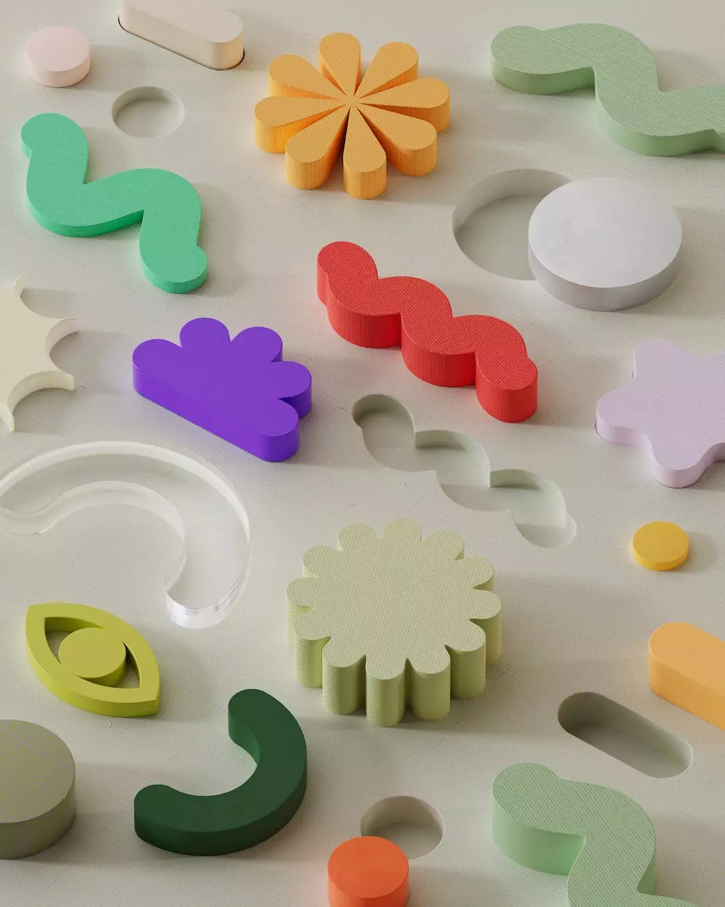
Creating Harmony with Color Combinations
Choosing the right color combination is key to creating a visually appealing and harmonious brand identity. Here are a few tips to help you find the perfect balance:
1. Color Wheel and Analogous Colors
The color wheel is a valuable tool to visualize color relationships. Analogous colors, which are adjacent on the wheel, create a harmonious and cohesive look. For example, using shades of blue and green together can create a sense of tranquility and balance.
2. Complementary Colors
Complementary colors are opposite each other on the color wheel. They create a high contrast and can be used to make certain elements stand out. For example, pairing blue with orange can create a visually striking combination.
3. Triadic Colors
Triadic colors are evenly spaced on the color wheel. They offer a balanced and vibrant color scheme. For instance, combining yellow, red, and blue can result in a bold and energetic visual impact.
4. Mood and Industry Alignment
Consider the mood and emotions you want your brand to evoke, as well as the industry you belong to. Colors can support the message you want to convey. For example, a spa-focused brand might opt for calming and soothing colors like pastel blues and greens, while a modern technology brand might choose sleek and minimalistic colors like black, white, and metallic tones.
Conclusion
Choosing your brand's color scheme is a critical decision that can shape how your audience perceives your brand. By understanding the psychology behind colors, considering your target audience, and creating harmony with color combinations, you can create a visually appealing brand identity that stands out from the competition.